Introduction
In this posting, I will walk you through the process of connecting a Choice Filter web part to a Chart web part so that the range of data shown in the chart depends on a user selection. The chart type will be a pie chart, and the filter type will be the Choice Filter web part. Interestingly, the Choice Filter web part won't be connected to a list that in turn is connected to a chart web part. Instead, the filter will be connected directly to the chart web part itself. This can be done because the chart web part has the capability to perform its own filtering on the datasets it consumes. Furthermore, it can also consume filter values that it will then apply to the datasets it has consumed. All of the steps for accomplishing this will be discussed here. Note: these steps require that you have at least Design permission level to the page containing the web parts.
Background
The scenario that will be explored here involves enabling a user to select different sets of data associated with routine monthly SharePoint patching and then see the selected data set displayed in a pie chart. A set of data involves the aggregated times associated with eight patching tasks:
- Preparation
- Operating System Update Installation (OSU)
- SharePoint Update Installation (SPU)
- Run Get-SPProduct all SharePoint Servers (GSP)
- Run PSCONFIG all SharePoint Servers (PSC)
- OWA Update Installation and OWA Reconfiguration (OWA)
- Miscellaneous Tasks (Misc)
- Review and Regression Testing (Rev)
These are the general tasks performed every month for SharePoint farm patching. The aggregate total times captured from such tasks are typically recorded to a list having a normalized transactional schema, where values are in minutes, as shown in Table 1 below. These are the times associated with patching two SharePoint 2013 farms. Each row represents a single dataset.
| Table 1 | |||||||||||
|---|---|---|---|---|---|---|---|---|---|---|---|
| Title | Date | Prep | OSU | SPU | GSP | PSC | OWA | Misc | Rev | Total | Include |
| Patching: production | 7/16/2016 | 0 | 192 | 105 | 139 | 195 | 6 | 0 | 60 | 11.52 | Yes |
| Patching: Development | 8/10/2016 | 30 | 117 | 124 | 188 | 38 | 9 | 0 | 64 | 9.35 | Yes |
| Patching: Production | 8/20/2016 | 37 | 144 | 133 | 31 | 35 | 16 | 0 | 36 | 6.93 | Yes |
| Patching: Development | 9/14/2016 | 10 | 131 | 127 | 120 | 95 | 7 | 0 | 55 | 8.97 | Yes |
| X-header | YA-Header | YB-Header | YC-Header |
|---|---|---|---|
| X1 | YA1 | YB1 | YC1 |
| X2 | YA2 | YB2 | YC2 |
| X3 | YA3 | YB3 | YC3 |

- Choose a particular dataset (set of X,Y values)
- Remove the X-values, leaving the Y-values (YA1, YB1, YC1...)
- Identify the column headers and pair them with the Y-values
| Item | Value |
|---|---|
| YA-Header | YA1 |
| YB-Header | YB1 |
| YC-Header | YC1 |
| Table 2 | |
|---|---|
| Task | Duration |
| Prep | 0 |
| OSU | 192 |
| SPU | 105 |
| GSP | 139 |
| PSC | 195 |
| OWA | 6 |
| Misc | 0 |
| Rev | 60 |
- Add an additional column to the table that identifies the patching session for the dataset. This is effectively the X-value for the dataset Y-values. Call it the Session column, and it will be used to filter for a specific dataset.
- Add an additional filter column to identify whether a data item should be included in the chart. This is useful when, perhaps, a particular update session only need to engage in some tasks or was a one-off that you don't want to include in your general process improvement data capture.
- Also add a column that provides additional explanation or definition of the task, calling it the Definition column.
- Lastly, reformat the Y-value headers to make them more readable and so that they can be conveniently sorted.
| Table 3 | ||||
|---|---|---|---|---|
| Session | Task | Duration | Include | Definition |
| 7/16/2016 | 1) Preparation | 0 | Yes | Review all updates |
| 7/16/2016 | 2) OS Updates | 192 | Yes | Install Operating System Updates |
| 7/16/2016 | 3) SP Updates | 105 | Yes | Install SharePoint Patches |
| 7/16/2016 | 4) Get-SPProduct | 139 | Yes | Run Get-SPProduct |
| 7/16/2016 | 5) PSCONFIG | 195 | Yes | Run PSCONFIG |
| 7/16/2016 | 6) OWA Updates | 6 | Yes | Install OWA updates |
| 7/16/2016 | 7) Miscellaneous | 0 | Yes | Miscellaneous tasks |
| 7/16/2016 | 8) Review | 60 | Yes | Testing and verification |
| 8/10/2016 | 1) Preparation | 0 | Yes | Review all updates |
| 8/10/2016 | 2) OS Updates | 192 | Yes | Install Operating System Updates |
| 8/10/2016 | 3) SP Updates | 105 | Yes | Install SharePoint Patches |
| 8/10/2016 | 4) Get-SPProduct | 139 | Yes | Run Get-SPProduct |
| 8/10/2016 | 5) PSCONFIG | 195 | Yes | Run PSCONFIG |
| 8/10/2016 | 6) OWA Updates | 6 | Yes | Install OWA updates |
| 8/10/2016 | 7) Miscellaneous | 0 | Yes | Miscellaneous tasks |
| 8/10/2016 | 8) Review | 60 | Yes | Testing and verification |
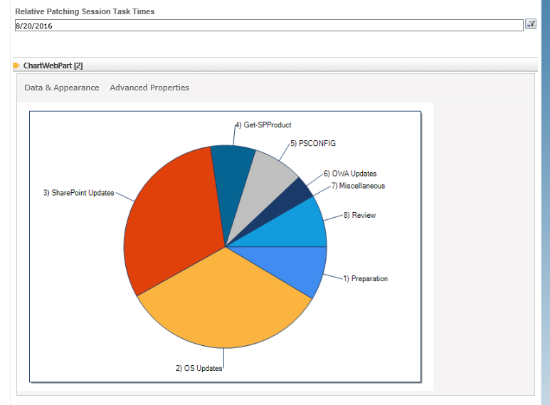
| 8/20/2016 | 1) Preparation | 0 | Yes | Review all updates |
| 8/20/2016 | 2) OS Updates | 192 | Yes | Install Operating System Updates |
| 8/20/2016 | 3) SP Updates | 105 | Yes | Install SharePoint Patches |
| 8/20/2016 | 4) Get-SPProduct | 139 | Yes | Run Get-SPProduct |
| 8/20/2016 | 5) PSCONFIG | 195 | Yes | Run PSCONFIG |
| 8/20/2016 | 6) OWA Updates | 6 | Yes | Install OWA updates |
| 8/20/2016 | 7) Miscellaneous | 0 | Yes | Miscellaneous tasks |
| 8/20/2016 | 8) Review | 60 | Yes | Testing and verification |
| 9/14/2016 | 1) Preparation | 0 | Yes | Review all updates |
| 9/14/2016 | 2) OS Updates | 192 | Yes | Install Operating System Updates |
| 9/14/2016 | 3) SP Updates | 105 | Yes | Install SharePoint Patches |
| 9/14/2016 | 4) Get-SPProduct | 139 | Yes | Run Get-SPProduct |
| 9/14/2016 | 5) PSCONFIG | 195 | Yes | Run PSCONFIG |
| 9/14/2016 | 6) OWA Updates | 6 | Yes | Install OWA updates |
| 9/14/2016 | 7) Miscellaneous | 0 | Yes | Miscellaneous tasks |
| 9/14/2016 | 8) Review | 60 | Yes | Testing and verification |
In summary, this is the process you need to work through in order to get the data prepared. Once you have a list like Table 3 created, you're ready to configure a chart to use that data. In the next section, you'll walk through the steps for accomplishing this.
Procedure
Step 1: Define Chart web part Filter Parameters
- Drop the Chart web part onto a page.
- Click Data & Appearance.
- Click Connect Chart to Data.
- Select Connect to a List, and then click the Next button.
- Select the website in the site collection containing the denormalized list, select the list, and then click the Next button. You'll now see your list displayed.
- Look up at the top of this list: do you see Filter Data? Click the arrow to expand it. This will reveal filters that you can define. Assuming that you have created a list having column names as shown in Table 3, configure the first parameter like so:
- Parameter Name: Session
- Type: DateTime
- Default value: 7/16/2016
- Now let's also implement the Include parameter. One thing: when you create this column, you selected the Yes/No type. Though it doesn't actually indicate this, it's implemented as a Boolean. When used in a list, and when you access the list in SharePoint, the value that you see for this column is Yes or No. But it is implemented as Boolean, but is not surfaced in that way. However, the Chart web part recognizes that column as in fact Boolean, and the values that it will show for that column are True and False. You don't need to change your list values, but you do need to account for this when specifying default or filter values.
- Parameter Name: Include
- Type: Boolean
- Default value: True
- Click the Preview Data button. This filters the list based upon the filter parameters you configured.

- Click the Next button. This page helps you configure a range of different chart aspects, including the data series' you want to present. For our needs, all you need to do is configure the Series Type, which should be Pie. Select that.

- Now click the Finish button. The pie chart will then be displayed. It needs some cleaning up, so let's do that next.


Step 2: Clean up the Pie Chart Display
- Click Advanced Properties. The first thing to do is configure a "collected slice," or a slice that contains other pie slices having less than some amount. Doing this helps clear up the clutter associated with having a number of very thin slices and their annotations all crammed together.
- From the Select an Element panel, select Series, and then scroll down to the bottom, to the Misc section. The configure as follows:
- CollectedThreshold: 10
- CollectedThresholdUsePercent: False
- CollectedThresholdExploded: True

- Now, from the Select an Element panel, select Chart (root element), and then scroll down to the bottom to the Image section. Then configure as follows:
- Height: 450
- Width: 650
- Now, from the Select an Element panel, select Series again, and then scroll down to the bottom, to the Misc section. The configure as follows:
- PieLabelStyle: Outside
- LabelsHorizontalLineSize: 0
- Staying on the Series element, scroll up until you see the MapArea section. Configure as follows (include the "#"):
- ToolTip: #VALY/#TOTAL (#PERCENT)
- This completes chart cleanup. You can certainly do far more here, but this is enough for our purposes. In the next step, you will add and configure a Choice Filter web part.

Step 3: Add and Configure a Choice Filter
- Put the page back in Edit mode.
- Drop a Choice Filter web part onto the page.
- Select Edit Web Part from the Choice Filter dropdown menu (hover the cursor over the web bar to see the dropdown appear).
- In the Filter section, enter a name for the filter and then enter a list of dates. These dates should be exactly the same as what you entered into the SharePoint list. Also enter a date that will be the default date. The default date is pushed into the Chart web part, when the page is instantiated and streamed to the user's browser. Having a default value ensures that the chart web part will display a chart when the user first connects to the page.

- Click OK. Now let's connect this filter web part to the chart web part.

Step 4: Connect the Choice Filter to the Chart
- Open the Choice Filter dropdown menu again, and then this time point to Connections, then point to Send Filter Values To, and then select the name of your chart web part. A dialog will appear. Note that the names of the parameters that appear in the dropdown on this dialog. Our Session parameter appears first.


- Select the Session parameter, and then click OK. Note the date that appears now in the Choice Filter web part. This is the default you entered previously.

- Click the small filter icon to the right of the Choice Filter web part. The Select Filter Value(s) dialog appears.

- Select another date, and then click OK. The dialog closes, and the page is refreshed, now displaying the data associated with that session date!

- At this point, you're set: you don't need any further significant configuration. The rest is customization.
- Here's a more cleaned up version: Note that to remove the toolbar, you'll need to edit the web page markup and set the Toolbar parameter of the Chart web part to False. See the references for additional detail on this. Unfortunately, I don't know how to make the chart Title also update per the Choice filter - the Title text doesn't accept keywords. If you know of a simple way, add your comment! For additional hints and guidance on customization, see


References
- AlsTechTips
- Using the Chart Web Part: Tips and Procedures
- How to create a no-code drill-down chart in SharePoint 2010
- Tips and Tricks with SharePoint and the Chart web part
- SharePoint 2013: Creating Chart Areas using the Chart Webpart
- MSDN Blogs
- Microsoft Chart Control How-to: Add Rich Content Using Keywords: this posting actually pertains to the .NET chart control, but much of its discussion also applies to the SharePoint Chart web part.
Notes
- If you should subsequently edit the Choice Filter web part again - maybe changing its title or some such - don't be surprised that this seems to break the connection between this web part and the Chart web part. I find this occurs almost every time. Even if I'm in SharePoint Designer and make a single change to a parameter (e.g., changing True to False), and carefully save the file so that nothing else is changed - even this causes the connection to break. The fix is simple: just rebuild the connection in the usual way.
- You can also implement a similar capability using the List Filter instead. This takes a list of values from a column in a SharePoint list that you specify. This approach enables you to update the filter parameter list by just editing a list rather than having to edit a web page (which requires Design level permission).
No comments:
Post a Comment